
This is an old revision of the document!
Table of Contents
APP - Customizer Screens
Admin Access Screen
The APP Admin Access screen lists all SAP® Business One users who will have access to the Windows based forms loaded by the Customizer and Dashboards modules in APP.
Click the SAP menu option titled TWBS Admin Access under the Administration  Setup APP Configuration menu to load the APP Admin Access screen.

- User ID column - Displays user ID of specific users permitted access to the Customizer/Dashboards WIndows based forms.
- User Code column - Displays user code of specific users permitted access to the Customizer/Dashboards WIndows based forms.
- User Name column - Displays user name of specific users permitted access to the Customizer/Dashboards WIndows based forms.
- Save button - Saves the assigned user information.
- Cancel button - Close the form.
- Add User button - Opens a form that lists all non-selected SAP® Business One users.
- Remove button - Will remove a highlighted SAP® Business One user from the form.

Publish Forms Screen
The APP Customizer Publish Forms screen lists all SAP® Business One forms or other APP registered forms that have been modified through APP Customizer.
Click the SAP menu option titled Publish Forms under the Administration Setup APP Configuration Customizer menu to load the APP Customizer Publish Forms screen.

- Form Type column - Displays the Form Type value of any SAP® Business One forms or other APP registered forms that have been modified through APP Customizer.
- Form Title column - Displays the Form Title value of any SAP® Business One forms or other APP registered forms that have been modified through APP Customizer.
- Select check box column - Allows for the selection of any SAP® Business One forms or other APP registered forms that have been modified through APP Customizer to publish modifications to all users.
Once the APP Customizer modifications for a form have been published, users will need to close and reopen any published forms in order for the modifications to be visible to the user.
- Publish button - Saves the APP Customizer modification information for the selected forms to the database for all users.
- Cancel button - Close the form.
Item Placement
Item Placement functionality allows the user to add objects (labels, text fields, buttons, and tabs) to enhance any SAP® Business One forms or UI-based add-on application screens or edit the properties of existing SAP objects without the use of programming knowledge.
Form Properties/Events Screen
The Form Properties/Events screen lists all properties and events for the form.
- Form - ID for the form where the configuration item is located.
- Item UID - Unique ID for the configuration item.
- Item Type - Type of the configuration item.
- Column UID - Unique ID of the column of the grid/matrix (if applicable).
- Active checkbox - Indicates if the item properties are active.
- Export button - Allows for the property to be exported (with associated Events data if needed) to an XML file.
- Property - Exports properties data only.
- Property with Events - Exports properties and associated events data.

- Save button - Save the Properties/Events to the configuration item.
- Save & Close button - Save the Properties/Events to the configuration item and close the form.
- Close button - Close the form.
Properties Tab
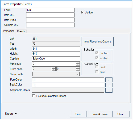
- Left - Left position measurement for the configuration item.
- Top - Top position measurement for the configuration item.
- Width - Width measurement for the configuration item.
- Height - Height measurement for the configuration item.
- Caption - Specifies a caption for the configuration item.
- Pane Level - This field will be used for tab folder objects to designate the pane level on which the contents of the tab will be displayed to the user.
- From Pane - Sets which pane levels for which the configuration item is visible. This option is applicable to displaying a configuration item on tabs.
- Group With - This field will be used for tab folder objects to designate the tab group in which the new tab will be displayed to the user on forms with multiple tab groups.
- Fore Color - Allows the user to select the fore color for the configuration item.
- Back Color - Allows the user to select the back color for the configuration item.
- Applicable Users - Allows for the assignment of the configuration item to specific users, branches, and/or departments.
- Exclude Selected Items checkbox - Option to designate that the specific users, branches, and/or departments listed in the Applicable Users field will be the ones excluded from application of the property.
- Behavior Options
- Enable checkbox - Option for the configuration item to be enabled.
- Visible checkbox - Option for the configuration item to be visible.
- Appearance Options
- Bold checkbox - Option for the configuration item to be bold.
- Italic checkbox - Option for the configuration item to be italicized.
Events Tab
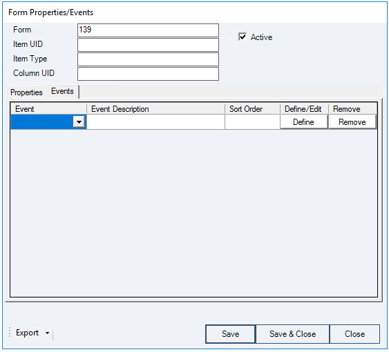
- Event column - Lists the events that can be optimized for the configuration item.
- Form Data Add
- Form Data Delete
- Form Data Load
- Form Data Update
- Form Activate
- Form Close
- Form Deactivate
- Form Key Down
- Form Load
- Form Resize
- Form Unload
- Menu Click
The events displayed will be filtered by the type of item being configured.
- Event Description column - Name assigned to the event on the Process Rules - Event Handler screen for the configuration item event.
- Sort Order column - Provides for the entry of order numbers (starting with 100) to allow for the ordering of multiple actions for the same Event.
- Define/Edit button column - Define or Edit the event for the item. This button will load the Process Rules Event Handler screen for the configuration item event.
- Remove button - Remove the event from the configuration item.
Item Placement - Item Configurator Screen
Item Placement capabilities allow the user to add objects (labels, text fields, buttons, and tabs) to enhance any SAP® Business One forms or UI-based add-on application screens or edit the properties of existing SAP objects without the use of programming knowledge.
The Item Configurator screen lists all configured items for a selected form.
- Click the SAP menu option titled Item Placement Configurator under the Administration
 Setup APP Configuration Customizer menu to load the Item Configurator screen.
When the Item Configurator screen is loaded from the main SAP menu option, no default data is loaded to the screen. The user must select a form from the drop down at the top of the screen to load the data for that specific form.
- To load the data for a specific form directly into the Item Configurator form, access the form that you want to see the information for. Select the Item Placement Configurator option from the APP Customizer menu group option from the right-click menu on the form.

- User List column - Displays specific users the configuration item is assigned to if not all users.
- Item UID column - Displays the Unique ID for the configuration item.
- Item Type column - Displays the type for the configuration item.
- Caption/Field column - Displays the Caption/Field for the configuration item.
- Column UID column - Displays the Column Unique ID for the configuration item.
- Edit button column - Edit the configuration for the item on the form. This button will load the Item Properties/Events screen for the configuration item.
- Remove button column - Remove the configured item from the form.
- Clone button column - Create a copy (clone) of the configured item within the same form.
- Copy To button - Copy the item configuration to another form.
- Close button - Close the form.
Item Placement - Item Properties/Events Screen
Item Placement capabilities allow the user to add objects (labels, text fields, buttons, and tabs) to enhance any SAP® Business One forms or UI-based add-on application screens or edit the properties of existing SAP objects without the use of programming knowledge.
The Item Properties/Events screen lists all properties and events for the configuration item.
If a property does not apply to the item that you are customizing, the fields for that property will be deactivated.
- Form - ID for the form where the configuration item is located.
- Item UID - Unique ID for the configuration item.
- Item Type - Type of the configuration item.
If the Item Type of the object is an edit text field, the user will have access to a button  to the right of the field that will allow the user to change the item to an extended edit text field by clicking on it.
- Column UID - Unique ID of the column of the grid/matrix (if applicable).
- Active checkbox - Indicates if the item properties are active.
- Export button - Allows for the property to be exported (with associated Events data if needed) to an XML file.
- Property - Exports properties data only.
- Property with Events - Exports properties and associated events data.
- Save button - Saves the Properties/Events to the configuration item.
- Save & Close button - Save the Properties/Events to the configuration item and close the form.
- Close button - Close the form.
Properties Tab
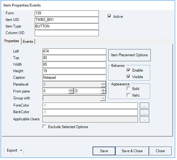
- Left - Left position measurement for the configuration item.
- Top - Top position measurement for the configuration item.
- Width - Width measurement for the configuration item.
- Height - Height measurement for the configuration item.
- Caption - Specifies a caption for the configuration item.
- Pane Level - This field will be used for tab folder objects to designate the pane level on which the contents of the tab will be displayed to the user.
- From Pane - Sets which pane levels for which the configuration item is visible. This option is applicable to displaying a configuration item on tabs.
- Group With - This field will be used for tab folder objects to designate the tab group in which the new tab will be displayed to the user on forms with multiple tab groups.
- Fore Color - Allows the user to select the fore color for the configuration item.
- Back Color - Allows the user to select the back color for the configuration item.
- Applicable Users - Allows for the assignment of the configuration item to specific users, branches, and/or departments.
- Exclude Selected Items checkbox - Option to designate that the specific users, branches, and/or departments listed in the Applicable Users field will be the ones excluded from application of the property.
- Behavior Options
- Enable checkbox - Option for the configuration item to be enabled.
- Visible checkbox - Option for the configuration item to be visible.
- Appearance Options
- Bold checkbox - Option for the configuration item to be bold.
- Italic checkbox - Option for the configuration item to be italicized.
Events Tab
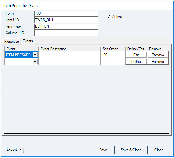
- Event column - Lists the events that can be optimized for the configuration item.
The events displayed will be filtered by the type of item being configured.
- Event Description column - Name assigned to the event on the Process Rules - Event Handler screen for the configuration item event.
- Sort Order column - Provides for the entry of order numbers (starting with 100) to allow for the ordering of multiple actions for the same Event.
- Define/Edit button column - Define or Edit the event for the item. This button will load the Process Rules Event Handler screen for the configuration item event.
- Remove button - Remove the event from the configuration item.
Process Rules
Process Rules functionality allows the user to add field validations and procedure executions to enhance any SAP® Business One forms or UI-based add-on application screens without the use of programming knowledge.
Process Rules Procedure Summary Screen
The Process Rules Procedures Summary screen provides the user with a summary of all Process Rules Procedures that have been created in the APP Customizer.
- Click the SAP menu option titled Process Rules under the Administration Setup APP Configuration Customizer menu to load the Process Rules Procedures Summary screen.

- Procedure ID column - The unique ID for the procedure.
- Procedure Name column - The procedure's descriptive name.
- Edit button column - Edit the procedure for process rules. This button will load the **Procedure Handler** screen for the configuration item.
- Remove button column - Remove the configured item from the form.
- Export button - Allows for all Procedures to be exported to an XML file.
- Close button - Closes the form.
Process Rules Event Handler Screen
The Process Rules Event Handler screen lists all of the event customization options for the configuration item. This screen is launched from the Events tab of the Item Properties/Events screen.
- Active checkbox - Indicates if the process rules are active.
- Show Procedures Linked to Current Form checkbox - Selection of this option will narrow the procedures available in the Execute Procedure drop down to only those procedures which are specifically associated with the form designated in the Form Type field.

- Event Description - The description assigned to the Event by the user.
- Event - The UI item event that the process rule will be applicable to. This value is filled in automatically based on the Event chosen on the Item Properties/Events screen.
Changes to the Event option will be reflected on the originating Item Properties/Events screen after applying the modifications.
- Sort Order - The value to determine the order in which events are to be executed if multiple events are assigned to the same object.
- Form Type - The form type for the form that the process rule will be applicable to. This value is filled in automatically based on the event chosen on the Item Properties/Events screen.
- Item UID - The unique ID for the item on the form that the process rule will be applicable to. This value is filled in automatically based on the event chosen on the Item Properties/Events screen.
- Applicable Users - Allows for the assignment of the configuration item to specific users, branches, and/or departments.
- Exclude Selected Items checkbox - Option to designate that the specific users, branches, and/or departments listed in the Applicable Users field will be the ones excluded from application of the event.
- Inner Event option - Indicates whether the event is internal.
- True
- False
- Ignore
- Before Action option - Indicates whether the event handler method is being called before the application handles the event or after.
- True
- False
- Ignore
- Action Success option - Indicates whether the application handled the event successfully.
- True
- False
- Ignore
The Action Success option is only applicable if the Before Action option is set to False.
- Available Modes - Form modes that the configuration item is valid for.
- Find Mode
- OK Mode
- Update Mode
- Add Mode
- Edit Mode
- Print Mode
- View Mode
- No Validation option - Performs no validation on the item/field.
- Execute Procedure - Identify a process rules procedure to be executed which can be an SAP status bar message, an SAP message box, an SAP query, or an APP Macro.
- … button - Edit the procedure for the item event. This button will load the Procedure Handler screen.
If the procedure to be executed is a query, the results of the query will be loaded into an SAP® Business One Query screen regardless of the option selected in the definition of the query being executed.
- Simple Validation option - Performs a simple field level validation based on a mathematical operation.
- Source Field - The field on the form that will be evaluated for the Source ValueTurquoise Highlighted Text by the selected Operation.
- Operation - The mathematical operation to be used in the simple validation.
- Equal
- Not Equal
- Less Than
- Greater Than
- Less Than Equal
- Greater Than Equal
- Is Empty
- Source Value - The value for the Source Field that will be evaluated by the selected Operation.
- Execute Procedure - Identify a process rules procedure to be executed (if the simple validation criteria is met) which can be an SAP status bar message, an SAP message box, an SAP query, or an APP Macro.
- … button - Edit the procedure for the item event. This button will load the Procedure Handler screen.
If the procedure to be executed is a query, the results of the query will be loaded into an SAP® Business One Query screen regardless of the option selected in the definition of the query being executed.
- Query Validation option - Performs a validation based on a SQL query.
- SQL - The SQL query to be used for validation.
- Value column - The value returned from the SQL query.
- Procedure column - Identify a process rules procedure to be executed (if the SQL query returns the associated Value) which can be an SAP status bar message, an SAP message box, an SAP query, or an APP Macro.
If the procedure to be executed is a query, the results of the query will be loaded into an SAP® Business One Query screen regardless of the option selected in the definition of the query being executed.
- Export button - Allows for the Event to be exported to an XML file.
- Save button - Save the Event to the configuration item.
- Save & Close button - Save the Event to the configuration item and close the form.
- Close button - Close the form.
Procedure Handler Screen
The Procedure Handler screen lists all options and properties for procedures.
- Procedure ID - Displays the unique ID for the procedure.
- Procedure Name - A descriptive name given to the procedure by the user.
- Default SAP Action option
- Continue option - Allows the default SAP actions to continue.
- Block option - Blocks the default SAP actions from continuing.
- Create Menu Shortcut button - Allows the user to create a menu shortcut to execute the procedure.
- Remove Procedure button - Removes the procedure.
- Export button - Allows for the Procedure to be exported to an XML file.
- OK button - Updates the procedure information.
- Cancel button - Close the form.
Macro Tab

- Record button - Specifies the SAP Business One® Query to be executed.
- Stop button - Specifies the SAP Business One® Query to be executed.
- Load Macro Editor button - This button will load the Macro Editor screen.
Pressing the Load Macro Editor button before recording a Macro will load a blank Macro Editor screen.
Pressing the Record button on an existing Macro will result in the loss of previous information from the Macro and the recording of new information. It will not append any previous Macro information.

Alerts Tab

- Alert Type - Designates the type of alert provided to the user.
- Message Box - Standard SAP Message Box.
- Status Bar - SAP Status Bar message.
- Severity - Indicates the level of the SAP Business One® status bar message displayed to the user.
- Success - A green status bar message usually indicating a successful SAP Business One® process.
- Warning - A light blue status bar message usually indicating an SAP Business One® warning indication.
- Error - A red status bar message usually indicating an SAP Business One® processing error.
Severity property applies only to the Status Bar alert type.
- Duration - Indicates the value of the SAP Business One® status bar that determines the length of time the Status Bar message is displayed to the user.
- Short
- Medium
- Long
Duration property applies only to the Status Bar alert type.
- Message - Specifies the text to be displayed to the user in the message alert.
Queries Tab

- Execute Query - Specifies the SAP Business One® Query to be executed.
Macro Editor Screen
The Macro Editor screen lists the event information for each step of a recorded Macro.
The Macro Editor will only support actions against screens where there are not multiple instances of that screen open in SAP® Business One when the macro is being performed. For example, a macro that performs an action against form #139 (the Sales Order form) should only be performed with one Sales Order form window open.

- Line Number column – The unique Line Number for the macro step within the macro.
The Action Type Samples Guide section of the guide provides samples for setting up each Action Type.
- Action Types column – The Action Type that the macro step is taking.
- AddRow - Adds a new row to the grid or matrix specified.
- CallAPPProcedure - Initiates another APP procedure. This allows the reuse of existing functional procedures and minimizes development time.
- ComboSelect - Executes a select on the combo box control specified.
The value for selection must be an existing option in the combo box.
- ConditionExecution - Executes a conditional statement and then evaluates the outcome to determine continuation of True or False branch of Macro.
- DeleteRow - Deletes a row in an SAP UI Matrix or Grid object.
- DisableItem - Disables the state of the control specified.
- DoubleClick - Executes a double-click on the control specified.
- EnableItem - Enables the state of the control specified.
- EndWhile - Completes a preceding WHILE loop within a Macro that will constantly be evaluated until a particular condition is met.
- ExecuteSQL - Executes a SQL statement.
- FormClose - Closes the specified form.
The form to be closed must have been opened in the same macro session.
- FormFreeze - Freezes the specified form state.
Useful with making multiple updates to the form to minimize data reloading. The FormUnfreeze must accompany this action at the end of the updates. Failure to execute the FormUnfreeze action will result in a non-functional form.
- FormUnfreeze - Unfreezes the specified form state.
- GetFieldValue - Assigns the specified form field value to a designated variable.
- GetSQLValue - Executes a specified SQL query and assigns the value to a designated variable.
- HideItem - Changes the visible property of the control specified to hide the item.
- ItemClick - Executes a click on the control specified.
- LineEvents - Evaluates actions to be performed against the lines of an SAP object.
- LoadB1Query - Loads the window to display the saved SAP® Business One query.
- LoadUserTable - Loads the window to display the SAP® Business One user-defined table.
- MacroCommand - Executes a Macro command. Supported commands include…
- GOTO <line #>
- EXIT
- BREAK
- CALLAPPPROCEDURE <Procedure ID>
- MenuClick - Executes a click on the menu specified.
- MessageBox - Sets the text to be displayed in a SAP® Business One message box.
- OpenExternalProgram - Executes an external application.
APP Customizer will pass the value specified for the OpenExternalProgram action type as if the user had typed the value on the Run command window. In order for a value to work through APP Customizer, it should be able to function if manually typed on the Run command window.
- RightClick - Executes a right-click on the control specified.
- SendKeys - Simulates the designated keystrokes on the specified control. Refer to the SendKeys Reference Guide.
- SetBackColor - Sets the background color of the form/item designated. Refer to the Color Guide for Color Properties.
- SetBubbleEventFlag - Sets the value of the BubbleEvent flag. A False value will prevent any normal SAP action from proceeding. Valid values are True or False.
- SetFieldValue - Assigns the designed value or variable value to the specified form field.
- SetForeColor - Sets the foreground color of the form/item designated. Refer to the Color Guide for Color Properties.
- SetFormTitle - Sets the form title caption.
- SetStatusBar - Sets the text to be displayed on the SAP® Business One status bar message.
- ShowItem - Changes the visible property of the control specified to show the item.
- Sleep - Suspends the current Macro thread for a specified period of time (in seconds).
- SupressSAPMessage - Suppresses an SAP message box for a determined # of seconds.
- While - Initiates a WHILE loop within a Macro that will constantly be evaluated until a particular condition is met.
- Form TypeEx column – The unique SAP® Business One ID for the form on which the macro step will be performed.
- Menu ID column – The unique SAP® Business One ID for the menu on which the macro step will be performed.
- Variable column – The variable that a value will be saved into/copied from while performing the macro step.
The value will be defaulted by the application but can be altered by the user.
- Item UID column – The unique SAP® Business One ID for the item on which the macro step will be performed.
- Column column – The unique SAP® Business One ID for the column in which the macro step will be performed.
- Row column – The unique SAP® Business One ID for the row in which the macro step will be performed.
- Value column – The value required by the macro step.
Clicking in the Value column will open the Macro Editor Values Entry screen.
- CallAPPProcedure - The Procedure ID of the APP procedure to be executed.
- ComboSelect - The value to be selected on the combo box.
The value for selection must be an existing option in the combo box.
- ConditionExecution - A logical expression to be evaluated | a Macro command to be executed if the logical expression is evaluated as TRUE | a Macro command to be executed if the logical expression is evaluated as FALSE.
- ExecuteSQL - The SQL statement to be executed.
- GetSQLValue - The SQL statement to be executed.
- LineEvents - Detailed information regarding the actions to be performed against the lines of an SAP object.
- LoadB1Query - The value of “Query ID - Category Name” to load the query.
- LoadUserTable - The name of the User Table to be loaded.
- MacroCommand - The Macro command to be evaluated.
- MessageBox - The value to be displayed in the message box.
- OpenExternalProgram - The file path of the application to be executed.
- SendKeys - The keystroke combination to be sent.
- SetBackColor - The integer value for the color code to be set as the back color.
- SetBubbleEventFlag - The value to be set as the bubble event flag (True/False).
- SetFieldValue - The value to be set in the form item.
- SetForeColor - The integer value for the color code to be set as the fore color.
- SetFormTitle - The text to be displayed in the form title area.
- SetStatusBar - The text to be displayed in the status bar | the type of message | the message display duration.
- Sleep - The period of time (in seconds) that the current Macro thread will be suspended.
- SupressSAPMessage - The # of seconds for the SAP message to be suppressed.
If no value entered, default suppression is 5 seconds.
- While - The logical condition expression to be evaluated for the continuation of the WHILE loop.
- Comments column – An optional description for the macro step.
- Active column – Indicates that the macro step is active.
- Validate Macro button - Evaluates the Macro to determine if it meets the minimum requirements.
- Save button - Save the Macro.
- Save & Close button - Save the Macro and close the form.
- Cancel button - Close the form.
Macro Editor Values Entry Screen
The Macro Editor Values Entry screen provides the means to enter the value associated with a Macro command. It also provides a syntax sample, arguments associated with the command, and an entered value example.

Extended Text Entry Field – The area for entering the value.
Command – The Macro command that the value is being entered for.
Syntax – An example of the syntax required for the value.
Arguments – An example of the required and optional arguments for the value.
Example – An example of correct value entry.
OK button – Save the value back to the **Macro Editor** screen.
Cancel button – Close the form.
Macro Editor Line Events Values Entry Screen
The Macro Editor Values Entry screen provides the means to enter the value associated with a Macro command. It also provides a syntax sample, arguments associated with the command, and an entered value example.

Available Line Events – A list of the previously created Line Events that can be loaded and reused.
Code – The automatically assigned unique code number for the Line Event.
Name – The user assigned descriptive name for the Line Event.
Form Type – The unique ID for the form on which the Line Event will operate.
Item UID – The unique ID for the item on which the Line Event will operate.
 Note – Line Events can be coded to only one form and item at a time.
Ignore Last Row checkbox – Designates that the Line Event will ignore the last row of the item when executing.
Load button – Loads the details of the selected Line Event into the form.
Define New button – Clears the form and assigns a new Code value to the Line Event being created.
Apply button - Apply the Line Event to the Macro Action Type.
Apply & Close button - Apply the Line Event to the Macro Action Type and close the form.
Close button - Close the form.
Action Type Samples Guide
The following are examples of action types taken directly from the APP Macro Editor. Each action type is represented and the optional/required fields for each action type are indicated in yellow/red respectively.
AddRow – Adds a new row to the grid or matrix specified.


Tip - Refer to the **How To Use the AddRow Action Type** section of the User Guide for a more detailed example.
CallAPPProcedure – Initiates another APP procedure. This allows the reuse of existing functional procedures and minimizes development time.

**Tip** - Refer to the **How To Use the CallAPPProcedure Action** **Type** section of the User Guide for a more detailed example.
ComboSelect – Executes a click on the combo box control specified.


Note - The value for selection must be an existing option in the combo box.
Tip - Refer to the How To Use the ComboSelect Action Type section of the User Guide for a more detailed example.
ConditionExecution – Provides conditional execution of statements based on the TRUE or FALSE evaluation of a specified logical statement.

**Tip** - Refer to the **How To Use the ConditionExecution Action** **Type** section of the User Guide for a more detailed example.
DeleteRow – Removes a row from an SAP Matrix or Grid UI object.

Tip - Refer to the How To Use the DeleteRow Action Type section of the User Guide for a more detailed example.
DisableItem – Disables the state of the control specified.

Tip - Refer to the How To Use the DisableItem Action Type section of the User Guide for a more detailed example.
DoubleClick – Executes a double-click on the control specified.

Tip - Refer to the How To Use the DoubleClick Action Type section of the User Guide for a more detailed example.
EnableItem – Enables the state of the control specified.


Tip - Refer to the How To Use the EnableItem Action Type section of the User Guide for a more detailed example.
EndWhile – Used in conjunction with While Action Type to form loop of execution based on conditional logic statement evaluated on While
Action Type.

Tip - Refer to the **How To Use the EndWhile Type** section of the User Guide for a more detailed example.
ExecuteSQL – Executes a specified SQL command.

Tip - Refer to the **How To Use the ExecuteSQL Type** section of the User Guide for a more detailed example.
FormClose – Closes the specified form.


Note - The form to be closed must have been opened in the
same macro session.

Tip - Refer to the How To Use the FormClose Action Type section of the User Guide for a more detailed example.
FormFreeze – Freezes the specified form state.

FormUnfreeze – Unfreezes the specified form state.

GetFieldValue – Assigns the specified form field value to a designated variable.
 Tip - Refer to the How To Use the GetFieldValue Action Type section of the User Guide for a more detailed example.
GetSQLValue – Executes a specified SQL query and assigns the value to a designated variable.

Tip - Refer to the How To Use the GetSQLValue Action Type section of the User Guide for a more detailed example.
HideItem – Changes the visible property of the control specified to hide the item.

Tip - Refer to the How To Use the HideItem Action Type section of the User Guide for a more detailed example.
ItemClick – Executes a click on the control specified.

Tip - Refer to the How To Use the ItemClick Action Type section of the User Guide for a more detailed example.
LineEvents – Evaluates actions to be performed against the lines of an SAP object.
Tip - Refer to the How To Use the LineEvents Action Type section of the User Guide for a more detailed example.
LoadB1Query – Loads the window to display the saved SAP® Business One query.
 Tip - Refer to the How To Use the LoadB1Query Action Type section of the User Guide for a more detailed example.
LoadUserTable – Loads the window to display the SAP® Business One user-defined table.

Tip - Refer to the How To Use the LoadUserTable Action Type section of the User Guide for a more detailed example.
MacroCommand – Executes a specified Macro command.


Tip - Refer to the **How To Use the MacroCommand Type** section of the User Guide for a more detailed example.
MenuClick – Executes a click on the menu specified.

Tip - Refer to the How To Use the MenuClick Action Type section of the User Guide for a more detailed example.
MessageBox – Sets the text to be displayed in a SAP® Business One message box.

Tip - Refer to the How To Use the Messagebox Action Type section of the User Guide for a more detailed example.
OpenExternalProgram – Executes an external application.


Warning - APP Customizer will pass the value specified for the OpenExternalProgram action type as if the user had typed the value on the Run command window. In order for a value to work through APP Customizer, it should be able to function if manually typed on the Run command window.

**Tip** - Refer to the **How To Use the OpenExternalProgram** **Action Type** section of the User Guide for a more detailed example.
RightClick – Executes a right-click on the control specified.

Tip - Refer to the How To Use the RightClick Action Type section of the User Guide for a more detailed example.
SendKeys – Simulates the designated keystrokes on the specified control. Refer to the **SendKeys Reference Guide**.


Tip - Refer to the How To Use the SendKeys Action Type section of the User Guide for a more detailed example.
SetBackColor – Sets the background color of the form/item designated.
Refer to the **Color Guide for Color Properties**.


Tip - Refer to the **How To Use the SetBackColor Action Type**
 section of the User Guide for a more detailed example.
SetBubbleEventFlag – Sets the value of the BubbleEvent flag. A False value will prevent any normal SAP action from proceeding. Valid values are True or False.

SetFieldValue – Assigns the designed value or variable value to the specified form field.

Tip - Refer to the How To Use the SetFieldValue Action Type section of the User Guide for a more detailed example.
SetForeColor – Sets the foreground color of the form/item designated.
Refer to the **Color Guide for Color Properties**.

Tip - Refer to the How To Use the SetForeColor Action Type section of the User Guide for a more detailed example.
SetFormTitle – Sets the title caption of the form designated.

Tip - Refer to the How To Use the SetFormTitle Action Type section of the User Guide for a more detailed example.
SetStatusBar – Sets the text to be displayed on the SAP® Business One status bar message.


 Tip - Refer to the How To Use the SetStatusBar Action Type section of the User Guide for a more detailed example.
ShowItem – Changes the visible property of the control specified to show the item.

Tip - Refer to the How To Use the ShowItem Action Type section of the User Guide for a more detailed example.
SupressSAPMessage – Suppresses an SAP message for a specified # of seconds.

While – Used in conjunction with EndWhile Action Type to form loop of execution based on conditional logic statement evaluated on While Action Type.

Tip - Refer to the **How To Use the While Action Type** section of the User Guide for a more detailed example.
SendKeys Reference Guide
Each key is represented by one or more characters.
To specify a single keyboard character, use the character itself. For example, to send the letter A, use A itself for the Code value.
To represent more than one character, append each additional character to the one preceding it. For example, to send the letters A, B, and C, use ABC for the Code value.
The plus sign (+), caret (^), percent sign (%), tilde (~), and parentheses () have special meaning in SendKeys. To send one of these characters, enclose it within braces ({}). For example, to send the plus sign use {+}. Brackets ([]) have no special meaning in SendKeys, but you must enclose them in braces. In other applications, brackets do have a special meaning that may be significant when dynamic data exchange (DDE) occurs. To specify brace characters, use and.
To send characters that aren't displayed when you press a key, such as ENTER or TAB, and keys that represent actions rather than characters, use the codes shown below:
| Key | Code | |
|---|---|---|
| Backspace | {BACKSPACE}, {BS}, | |
| or {BKSP} | ||
| Break | {BREAK} | |
| Caps Lock | {CAPSLOCK} | |
| Delete | {DELETE} or {DEL} | |
| Down Arrow | {DOWN} | |
| End | {END} | |
| Enter | {ENTER} | |
| Esc | {ESC} | |
| Help | {HELP} | |
| Home | {HOME} | |
| Insert | {INSERT} or {INS} | |
| Left Arrow | {LEFT} | |
| Num Lock | {NUMLOCK} | |
| Page Down | {PGDN} | |
| Page Up | {PGUP} |
|---|---|
| Right Arrow | {RIGHT} |
| Scroll Lock | {SCROLLLOCK} |
| Tab | {TAB} |
| Up Arrow | {UP} |
| F1, F2, F3… | {F1}, {F2}, {F3}… |
| Shift | {+} |
| Ctrl | {^} |
| Alt | {%} |
Note - To specify the combination of the Shift, Ctrl, or Alt keys with another keystroke, precede the keystroke value with the {+}, {^} or {%} code for the key to combine it with .
Note - To specify that any combination of Shift, Ctrl, and Alt should be held down while several other keys are pressed, enclose the code for those keys in parentheses. For example, to specify holding down Shift while E and C are pressed, use “+(EC)”. To specify holding down Shift, while E is pressed, followed by C without Shift, use “+EC”.
Warning - SendKeys does not support sending the same keystroke value repeatedly.
Warning - SendKeys does not support sending keystroke combinations that are not relevant to SAP® Business One. For example, all of the function keys currently do not have any functionality associated with them.
Tab Order Sequence
Tab Order configuration functionality allows the user to establish, edit, and remove custom designated tab orders for forms that will override the normal order of moving between fields on a form.
The tab order cannot be used to set the tab order of columns in an SAP UI grid or matrix object. This is an SAP® Business One UI limitation.
Tab Order Configuration Summary Screen
The Tab Order Configuration Summary screen lists all tab sequences associated with a form.
Click the SAP menu option titled Tab Sequence Configurator under the Administration -Setup -APP Setup -Customizer menu to load the Tab Order Configuration Summary screen.
Note - When the Tab Order Configuration Summary screen is loaded from the main SAP menu option, no default data is loaded to the screen. The user must select a form from the drop down at the top of the screen to load the data for that specific form.
To load the data for a specific form directly into the Tab Order Configuration Summary screen, access the form that you want to see the information for. Select the Tab Sequence Configurator option from the APP Customizer -Tab Order menu group option from the right-click menu on the form.


Description - The description given to the tab order sequence.
User List - The list of any specific users associated with the tab order configuration. A blank value means it applies for all users.
User Type - The type of users associated with the tab order configuration. A blank value means it applies for all users.
Exclude - Indicates if the Exclude Selected Items checkbox on the **Tab Order Configuration Detail** screen was selected. “T” indicates it was selected, “F” indicates it was not selected.
Edit button - Edit the tab order sequence details. This button will load the **Tab Order Configuration Detail** screen.
Remove button - Remove the tab order sequence.
Copy To button - Copy the tab order sequence details to another form.
Close button - Close the form.
Tab Order Configuration Detail Screen
The Tab Order Configuration screen lists all information associated with a tab sequence.
Click the **Edit** button for a tab sequence on the **Tab Order** **Configuration Summary** screen.


Code - The unique ID given to the tab order configuration.
Form Type - The type of the form for which the tab order configuration is assigned.
Description - The description given to the tab order sequence.
Applicable Users - The specific user(s) to which the tab order sequence is assigned if not assigned to all users.
Exclude Selected Items checkbox - Option to designate that the specific users, branches, and/or departments listed in
the Applicable Users field will be the ones excluded from application of the tab order sequence.
Item UID - The unique item ID of the item in the tab order configuration.
Description - The description of the item in the tab order configuration.
Active checkbox - Indicates if the tab order configuration is active.
Add button - Add an additional item to the tab order sequence.
Remove button - Remove the item from tab order sequence.
Up button - Move the highlighted item one spot higher in the tab order sequence.
Down button - Move the highlighted item one spot lower in the tab order sequence.
OK button - Save the information and close the form.
Cancel button - Close the form.
Mandatory Fields
Mandatory Fields functionality allows the user to establish, edit, and remove custom designated mandatory fields for forms that will operate in addition to the normal required fields on a form.
Mandatory Fields Configuration Summary Screen
The Mandatory Fields Configuration Summary screen lists all mandatory fields configurations associated with a form.
Click the SAP menu option titled Mandatory Settings Configurator under the Administration -Setup -APP Setup -Customizer menu to load the Mandatory Fields Configuration Summary screen.
Note - When the Mandatory Fields Configuration Summary screen is loaded from the main SAP menu option, no default data is loaded to the screen. The user must select a form from the drop down at the top of the screen to load the data for that specific form.
To load the data for a specific form directly into the Mandatory Fields Configuration Summary screen, access the form that you want to see the information for. Select the Mandatory Settings Configurator option from the APP Customizer -Mandatory Fields menu group option from the right-click menu on the form.

Description - The description given to the mandatory fields. Warning - Indicates if the Warning Only checkbox on the **Mandatory**
Fields Configuration Detail screen was selected.
User List - The list of any specific users associated with the mandatory fields. A blank value means it applies for all users.
User Type - The type of users associated with the mandatory fields. A blank value means it applies for all users.
Exclude - Indicates if the Exclude Selected Items checkbox on the **Mandatory Fields Configuration Detail** screen was selected. “T” indicates it was selected, “F” indicates it was not selected.
Edit button - Edit the mandatory fields details. This button will load the **Mandatory Fields Configuration Detail** screen.
Remove button - Remove an item from the mandatory fields.
Clone button - Create a copy (clone) of the mandatory fields.
Copy To button - Copy the mandatory fields details to another form.
Close button - Close the form.
Mandatory Fields Configuration Detail Screen
The Mandatory Fields Configuration screen lists all information associated with a mandatory fields configuration.
Click the **Edit** button for a tab sequence on the **Mandatory Fields** **Configuration Summary** screen.

Code - The unique ID given to the mandatory fields.
Form Type - The type of the form for which the mandatory fields are assigned.
Description - The description given to the mandatory fields. Add/Update UID - The unique ID of the form item that is responsible for the Add/Update functionality of the form.

Note - On most SAP® Business One forms, the unique ID of the OK/Add/Update button is “1”.
Applicable Users - The specific user(s) to which the tab order sequence is assigned if not assigned to all users.
Exclude Selected Items checkbox - Option to designate that the specific users, branches, and/or departments listed in
the Applicable Users field will be the ones excluded from application of the mandatory fields.
Check During Add checkbox
<ul><li><p>
Designates that the verification of completion will be done on add of the object.
</p></li></ul>
 Check During Update checkbox - Designates that the verification of completion will be done on update of the object.
Mark Mandatory Fields with Color - Indicates which color will be used to mark fields that are including in the setting of the mandatory fields. Item UID - The unique item ID of the item in the mandatory fields.
Description - The description of the item in the mandatory fields. Column - The unique column ID of the item in the mandatory fields if located in a grid/matrix.
Empty Value - Indicates the empty value.
Ignore Last Row checkbox - Designates that the last row will be ignored. Warning Only checkbox - Designates that the user will be prompted with warning messages only if the designated fields are not completed. This will not prevent the add/update of the object.
Active checkbox - Indicates if the mandatory fields is active.

Add button - Add an additional item to the mandatory fields.
Remove button - Remove the item from the mandatory fields.
OK button - Save the information and close the form.
Cancel button - Close the form.

Manage Control State Screen
The Manage Control State screen allows for the management of the visible and enabled properties for all controls on a screen in a centralized interface.
Note - The visible/enabled properties are not being removed from the **Form Properties/Events** screen. Any values set for controls there in previous versions of APP will retain their values. However, any **Manage Control State** customized entries will override the **Form** **Properties/Events** screen settings.
Right click the SAP form you want to manage controls for. Select the option titled Manage Control State under the APP Customizer right click menu to load the Manage Control State screen.
Warning - Only one entry per form control is allowed and modifiable on this screen. Therefore you cannot have one line for a control assigned to or excluding specific users and also have a second line configured differently for the same control.
Warning - The customized entry on the Manage Control State screen will be overriden by any customized properties set directly on the control itself.

Item UID – The unique Item ID of the form control.
Description – The description of the form control.
Item Type – The item type of the form control.
Enable (Add Mode) checkbox – Determines if the control is enabled in Add mode.
Enable (OK Mode) checkbox – Determines if the control is enabled in OK mode.
Enable (Find Mode) checkbox – Determines if the control is enabled in Find mode.
Visible (Add Mode) checkbox – Determines if the control is visible in Add mode.
Visible (OK Mode) checkbox – Determines if the control is visible in OK mode.
Visible (Find Mode) checkbox – Determines if the control is visible in Find mode.
Users - Allows for the assignment of the control modifications to specific users, branches, or departments.
User Settings dropdown - Includes/excludes the users specified in the Users field.
User List Type - Displays User, Branch or Department based upon users specified in the Users field.
OK/Update button – Adds or updates the custom menu option
information.
Cancel button – Close the form.
Menu Shortcut Screen
Menu shortcut maintenance capabilities allow the user to establish, edit, and remove custom menu options from the SAP® menu structure that are associated with APP Customizer defined procedures.

Coming Soon - Ability to add right
click menus.
Click the SAP menu option titled Add/Edit Menus under the Administration -Setup -APP Setup -Customizer menu to load the Menu Shortcut Maintenance screen.

Code - The unique internal ID for the custom menu option.
Menu UID - The unique Menu ID for the custom menu option.
Menu String - The caption for the custom menu option.
Image - The image associated with the custom menu option.

Note - Image should be no larger than 16 pixels by 16 pixels.
Description - The internal description for the custom menu option.
Parent Menu - Identity of the parent menu used for placement of the custom menu option.
Sub Menu - Identity of the sub menu used for placement of the custom menu option.
Position dropdown - Indicates the position of the custom menu option in relation to the parent menu.
Above

Below
Procedure dropdown - Lists all available APP Customizer procedures defined in the system.
Applicable Users - The specific user(s) to which the tab order sequence is assigned if not assigned to all users.
Exclude Selected Items checkbox - Option to designate that the specific users, branches, and/or departments listed in the Applicable Users field will be the ones excluded from application of the mandatory fields.
Activate checkbox - Indicates if the custom menu option is active.
Add/Update button - Adds or updates the custom menu option information.
Cancel button - Close the form.
Customizer User List Screen
Many of the APP Customizer screens allow for the specification of the users, branches, or departments to which the settings either will or will not be applied. The User List screen is a commonly used screen amongst customizer features to allow for this designation.
The following methods can be used to launch the User List screen…
Clicking on the  button on the **Item Properties/Events** screen.
Clicking on the  button on the **Process Rules Event Handler** screen.
Clicking on the  button on the **Tab Order Configuration Detail** screen.
Clicking on the button on the **Mandatory Fields Configuration** **Detail** screen.

Note - To view the user information in the system, click the SAP menu option for Users under the Administration -Setup -General menus to load the Users - Setup screen.
Users Tab

Select checkbox - This checkbox is used to select a user.
User ID - The User ID value of the user from the SAP® Business One Users - Setup screen.
User Code - The User Code value from the SAP® Business One Users - Setup screen.
Branches Tab

Select checkbox - This checkbox is used to select a branch. Name - The branch name value from the SAP® Business One Branches - Setup screen.
Remarks - The branch description value from the SAP® Business One Branches - Setup screen.
Departments Tab

Select checkbox - This checkbox is used to select a department.
Name - The department name value from the SAP® Business One Departments - Setup screen.
Remarks - The department description value from the SAP® Business One Departments - Setup screen.
Color Guide for Color Properties
APP Customizer includes the ability to set values for display colors for several properties of forms and items. Several commonly used colors are referenced below for easy application of the values and the methods that can be used to determine a color are explained.
Commonly Used Color Values
 Red (255)
 Pink (12615935)
 Orange (33023)
 Yellow (65535)
 Lt. Green (8454016)
 Green (65280)
 Lt. Blue (16777088)
 Blue (16744448)
 Purple (8388736)
 White (16777215)
 Gray (12632256)
 Brown (4210816)
Selecting A Color Value
Click the … button next to the field that you want to specify a color for.
 Select a color through one of the following means…
Select a Basic Color or a pre-defined Custom Color.
Drag the crosshairs graphic around the rainbow color chart to determine your color.
Manually enter the Red, Green, Blue (RGB) or Hue, Saturation, Luminescence values for the color.

Click the OK button.


