Table of Contents
Control Properties
Each form control has a set of properties that define how it functions. The properties may change based on the type of control, but there are some basic properties that are used by all controls.
- The properties page is always displayed when a control is first added to a form. Known changes can be added at this time. To modify the properties later, click the Edit link on a control to access its properties page.
Common Properties
Certain properties are found on most controls. These common properties are described below. Properties that are specific to a type of control are then discussed in the following sections.

- Table Name displays the underlying table used by this form. This is shown for information only.
- This value is not displayed for Section Title, File Upload, and Button controls.
- Field Name displays the column name in the underlying table used by this control.
- The associated field is automatically displayed when the control is created using a database field.
- If the control is added to the form via the Control Type Method, available fields are listed in the drop-down list.
- This value is not displayed for Section Title, File Upload, and Button controls.
- Data Type displays the database data type of the column used by this control. This is shown for information only.
- This value is not displayed for Section Title, File Upload, and Button controls.
- Control Type displays the type of control in use.
- Available values are displayed in the drop-down list.
- Caption is the value that is displayed to the user for this control.
- The value can be changed at any time.
- For the button control this value is the text displayed on the button.
- Caption Position defines where the caption for the control appears.
- Options are Above and Left.
- When the Left option is selected you can also specify the size of the control (field) vs. the size of the caption. The larger the “Control Width” value, the larger the width of the data entry field and the smaller the width of the caption text.

- This option is not displayed for Section Title, File Upload, and Button controls.

- Text Align defines how the text is displayed in the field of the control.
- Options are Left, Center, and Right.
- This option is not displayed for File Upload, Signature, and Button controls.
- Character Length defines the maximum number of characters that can be entered in a field of the control.
- For text fields the value can be less than the number of characters defined in the database if you wish to restrict the value entered.
- For numeric fields the value should be the maximum number of digits you want to accept in the field. Because of the way data is stored this may be greater than the number of bytes defined for the column in the database.
- For date fields the value should be large enough to accommodate the date as it is defined by the selected Culture.
- This option is only displayed for Text Box, Numeric Text Box, Date Picker, and Time Picker controls.
For the next three controls, see Using the Color Picker for additional information on selecting and applying colors.
- Fill Color defines the color used as the background of the field of the control.
- Click on the drop-down arrow to access the color-picker tool.
- The default fill color is white.
- This option is not available on Button controls.
- Text Color defines the color used for text/numbers entered/displayed in the field of the control.
- Click on the drop-down arrow to access the color-picker tool.
- The default text color is black.
- This option is not available on Button controls.
- Caption Color defines the color used for the text of a field caption.
- Click on the drop-down arrow to access the color-picker tool.
- The default caption color is black
- This option is not available on Button controls.
- Default Value is used to populate the control field with an initial value when a new record is created.
- The value can be any value that is consistent with the type of control (e.g. text for Text Box controls, numbers for Number Text Box controls, and dates for Date controls).
- This option is only available on fields that accept text/number/date input.
- See System Default Values for information on special default values provided by the Versago system.
- Help Text is used to provide additional information to the user when the hovers over the field.
- This option is only available on fields that accept text/number/date input.
- The maximum size of help text is 100 characters.
- Formula is used to provide various types of calculation operations that can be used to populate a field based on values in other fields.
- Formulas can only be applied to numeric and date values.
- See Formulas for information on the creation and use of formulas.
Control Options
There a six “control options” available.
- Editable controls access to the field on the page. If Editable is selected the field can be entered (or the button clicked). Otherwise the field cannot be entered and will be skipped in the tabbing order.
- Visible defines if a field is displayed on the page. If Visible is selected the field is displayed. Otherwise the field is not displayed. This is helpful when fields are populated with “system” values that are not of interest to the user, but need to be captured for subsequent processing.
- If a field is not visible, the editable option is irrelevant since the field cannot be seen.
- Mandatory indicates that the user must provide a value in the field before the record can be saved.
- Mandatory fields are marked with a small red * next to the caption to alert the user.
- Databind indicates that the field is associated with a column in the underlying table. Any data placed in the field will be saved in the database record.
- The Databind option is enabled automatically when a control is created that is associated with a column in the underlying table
- Clearing the Databind option can be used in special situations where you want information to be displayed in a field but not be saved in the database.
- Primary Field indicates that this field is the value used as the primary key in the database table.
- The primary field option is enabled automatically based on the underlying database table structure.
- The primary field control must be placed in the form layout in order for the form can be saved.
- The primary field option should never be changed as it will cause the form to stop working.
- Initial Focus indicates that the cursor is to be positioned in this field when a form is first opened or cleared for a new record.
- This is a special use case since the cursor is automatically positioned at the first editable field on the page.
- Tab order start from this field and moves to the next editable field when this option is used.
- Only one field can be designated with this option.
Control Events
Control Events are managed on the “ControlEvents” tab for a specific control. At this time (v2.2) only one event and one action are available. Additional events & actions are planned for future versions of Versago.
The only available event is “OnLostFocus”. This means that the associated action occurs when the cursor leaves the field where the event is enabled. The only available action is “FormFind”. When the “OnLostFocus” is triggered, the information related to the record in the field is automatically retrieved and the form is populated. Because the “FormFind” is the only action available, a control event should only be applied on the primary key field of the form.
If this control event is enabled the primary key field must also be enabled. This allows the user to enter the field, enter a record (primary key) number, and exit the field to trigger the FormFind action.
Keep in mind that this approach to opening an existing record does not allow for any security control. Any user that can access the form can access any record associated with the form. A better approach may be to create a report that provides an Action Link to open the form. In this way a user can be limited to a certain subset of records.
Control-Specific Properties
Date Picker Controls
Formatting is available for Date and Time Picker controls using the Format function.
- Be sure the Control Type is Date Picker.

- Set the Format to Date or DateTime.
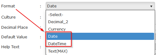
- Select the desired Culture from the list

- Also select the desired time format (12 hour or 24 hour) if you are also capturing a time value.
- If your Format is Date, the user will not see an icon to set the time value. The time value will be saved as midnight (00:00.000)
- If your Format is DateTime, the user will also see an icon to set the time value. The time value will be saved based on the user-entered value.


Time Picker
- Be sure the Control Type is Time Picker.

- Set the Format to DateTime.

- Select the desired Culture from the list
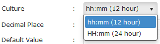
- When a Time Picker is used the date is saved as 01-01-1900 and the time is saved based on the user entered value.


Numeric Text Box
Formatting is available for Numeric Text Box controls using the Format and Decimal Place functions. There are three general options for formatting numeric values: None, Decimal, or Currency.
- None formatting is used to present numbers as integers (no decimal places).

- Set Format to -Select-.
- Set Decimal Place to 0 (zero).
- The number in the field is set to a whole number (integer). Any values entered to the right of a decimal point are truncated.
- Decimal_2 formatting is used to present numbers as decimal numbers.

- Set Format to Decimal_2.
- Set the desired number of decimal places (up to 6).
- A value of 0 is automatically interpreted as 2.
- The decimal value is rounded if more than the specified number of characters is entered to the right of the decimal point.
- Currency formatting is used to present numbers with the appropriate currency symbol and decimal formatting.

- Set Format to Currency.
- Select the desired Culture from the drop-down list.
- Set the desired number of decimal places (up to 6).
- A value of 0 is automatically interpreted as 2.
- The decimal value is rounded if more than the specified number of characters is entered to the right of the decimal point.
Lookup Report
Lookup Reports are available for Text Box and Drop-down List/Dynamic List controls.
See Lookup Reports for information on configuring and using Lookup Reports.
See Dynamic Drop-down Lists for information on configuring and using Dynamic List lookup reports.
Image Control
The Image control is used to display an image in the form presentation. Images are most commonly used in a grid (form details) control to display things like items in an order form. However, there is no restriction against using an image control in the main (header) section of the form as well. An example might be displaying the item associated with a Service Call, or displaying the logo of a company in an order entry form.

The data type of the underlying database field is Text. This is because the data is actually a file path pointer to the location of the image file, which is stored on disk. The file path information is saved as part of the form data. The image can then be displayed in a report associated with the form.
The Format drop-down selection defines the size of the image in the form. Two options are available: 45 x 45 pixels and 65 x 65 pixels. A large image is displayed when the user hovers over the image on the form, and an even large image is displayed as a pop-out when the user clicks on the image.