
This is an old revision of the document!
Table of Contents
Introduction (Dashboards)
Versago Dashboards provide a way to display information from multiple Versago sources in a single web page. Grids (standard report output) and charts can be displayed. There are also options for a “gauge” presentation and for custom HTML.
Audience
This document is intended for users that will be developing & maintaining Versago Dashboard. It is not intended as an “end user” guide. The creation and maintenance of Versago Dashboards does require knowledge of Versago Reports.
Related Documents
- Versago Reports – Configuration Guide
- Versago Reports - Charts
Before You Begin
Before you begin creating a Versago Dashboard, there are some things that need to be considered. Having answers to the following questions will help make the Dashboard creation process more efficient.
Determine the information that needs to be presented
The primary thing to be determined is what information needs to be presented. The content displayed in dashboards comes from Versago reports. Also decide if the information should be presented as a grid (rows & columns) or graphically as charts. Dashboard presentation is very commonly focused on graphic presentation.
The various elements displayed in a dashboard do not necessarily have to be related. The primary driver should be what information makes sense together for the end users. For example, while a Sales Manager might want to see only sales related information, a Controller might want to see bank account values, inventory value, order backlog, and open Accounts Receivable in their dashboard.
Determine the basic layout of the Dashboard
A Versago dashboard can present multiple elements of information. There can be one or two elements in each horizontal row. A dashboard can then include multiple horizontal rows. The layout will depend on the number of elements to be displayed, and how complicated the information in the element is. For example, a column chart with ten x-axis values might need to be in a row by itself, while a simple pie chart might easily fit into a row with two display elements.
Also keep in mind that one of the purposes of a dashboard is to provide “information at a glance.” If the user must scroll down the page to find a piece of information, the dashboard may go unused. Limiting the number of vertical rows may make the dashboard easier for the end user to utilize.
The example below illustrates how a dashboard might be configured.

To Begin
- Click on the Admin link in the profile section of the Versago home page to access the Administration console.
- Dashboard configuration is found under the Dynamic Content category of the menu.
Dashboard Maintenance
- Click on the “Dashboards” link in the Admin console to begin.

The Dashboard maintenance function consists of three elements, each on a separate tab.
- A listing of existing dashboards. This view is displayed when the function is opened.
- Click the [Add New Dashboard] button to create a new report.
- Click the link in the Dashboard Name column to edit an existing report.
- Click the red X on a row to remove the dashboard.
- The remaining elements (tabs) can are accessed in sequence to create a new dashboard, or directly when maintaining an existing dashboard. The use of each element is described in the following sections.
Creating New Dashboard
Assign Roles
As with all other Versago functions, Roles control access to dashboards. When creating a new dashboard, the Roles selection is the first stop of adding a new dashboard.

- At least one role must be selected for the dashboard to be saved.
- Roles can be changed at any time.
- Click the “Dashboard Editor” tab to continue.
Assign Name and Initial Frame
A basic dashboard must have a name and at least one frame to be added. The following steps will allow you to add a basic dashboard for additional configuration.

- Enter a Name for the dashboard.
- This name is displayed in the menu structure and can be changed at any time.
- Click [Add New Frame].
- Information about managing frames is found in the next section of this document.
- [Save] and [Finish] can only be used after adding the first frame as described below. [Cancel] can be used at any time.
- Click [Save] to add the new dashboard and continue working.
- Click [Finish] to add the new dashboard and return to the dashboard listing page.
- Click [Cancel] to discard any changes and return to the dashboard Roles tab.
Dashboard Editor
A dashboard is made up of a series of Frames. A frame may span the entire page horizontally, (a “row”) or may be divided into two frames across the row. There may then be multiple “rows” displayed vertically down the page.
Frame Configuration
Each frame has its own configuration elements.

- Select an Object Type from the drop-down list.
- Grid is the standard row/column presentation of a Versago report.
- Calendar reports do not currently display the calendar layout. This will be addressed in a future update of Versago.
- Reports should typically not use User-Applied Filters. The filters will work, however this somewhat defeats the purpose of the dashboard as a “quick view” presentation.
- Chart is a chart presentation from a Versago report.
- Custom Page provides a way to design a custom “page” that is displayed within the frame. This option is not fully functional and should be used with caution as it may change in a future version of Versago.
- Gauge is a dial gauge presentation of data from a Versago report. See //Appendix A – Gauges// for additional information.
- Select an Object from the “Select Object” drop-down.
- The selection list will change depending on the Object Type selected in step 1.
- Selecting the Custom Page object type presents an HTML editor area for creating the “page” within the frame.
- Change the Frame Height using the arrows in the field.
- A larger number increases the vertical height, a lower number reduces it.
- The size adjustment only works with the “chart” object type.
- Frame manipulation tools to manage the current frame.
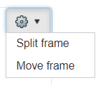
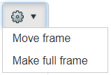
- Split Frame immediately splits a full page-width frame into two half-page frames.
- Make full frame immediately changes a half-page frame into a full page-width frame as a new row in the vertical structure.
- Move frame presents a new dialog to indicate where the current frame should be moved. This is a frame-for-frame swap. For example, assume that Frame 2 is half-page and Frame 3 is full-page. If 2 is moved to 3 (or vice versa), the object in 3 becomes half-page and the object in 2 becomes full page. Click [Submit] to execute the move.
- Use Delete Frame to delete the current frame
- If the current frame is half-page, the remaining frame will automatically become full frame.


There are three additional options on a frame labeled Link To, Default Filter, and Conditional Filter. The options were used in Versago versions prior to v2, but are not enabled for v2.0 and higher.
Adding Additional Frames
Once the initial dashboard has been created, additional frames can be added. Click the [Add Frame] button to begin. The “Create Frame” window is presented.

- Add a new Full Frame using the “Full Frame on a new row” option. Use the “before” and “after” options to place the new frame in the vertical row sequence.
- Add a new half-page frame using the “Split Frame on existing row” to convert an existing full-page frame to two half-page frames.
- Change an existing split (half-page) frame using the “Make split Frame to full frame” option
- Functions 2 and 3 can also be accomplished using the “Additional controls” on the desired frame as described earlier.
It is highly recommended that a new frame be added as a full frame and configured. Once the configuration is complete the frame can be moved to a split frame as needed.
Moving Frames with Drag-and-Drop
Frames can be moved around in the dashboard structure using “drag-and-drop.”
- Click and hold down the left mouse button on the frame to be moved.
- Begin to “drag” (move the cursor while holding down the left mouse button) the frame and the border of the frame will turn red.
- Drag the frame to its new position. The border around the target frame will turn green when the new frame is in position.
- “Drop” the frame by releasing the left mouse button. After a slight delay, the position of the two frames will be swapped.
Appendix A – Gauges
A gauge is a special dashboard object that is used to display a current value against a known range of values. A typical example of this might be year-to-date sales against a target range. An example of this is shown below.

In this case we are looking at YTD profit against an established range of values. The gauge has been structured so that the “best” range is shown at the top of the gauge.
We have defined three ranges for evaluation. The setup for these ranges is shown below. The gauge needle will reflect the current value of the underlying data any time the gauge is displayed.
Create a Report
The information displayed in a gauge comes from a Versago report. This report can be very simple in the detail it reports since it only needs to provide numeric values for the gauge. The report will ideally only have one numeric value. Multiple numeric values tend to cause issues with the reporting in the gauge.
It is not necessary to calculate a sum of the numeric values in the report. The gauge processing automatically does the summation.
The report can include parameters, but they should not be displayed to the user. Rather, they can be used to make updates of the data included in the report somewhat easier for the administrator.
Add a Dashboard Frame for the Gauge
Add a new frame in the dashboard as described above. The settings are illustrated in the following dashboards.

The Select Object drop-down will list only reports. Default Value is automatically determined as the first numeric column in the report. This is why the only numeric value in the report is the one to be used in the gauge.
Setting the Value Ranges
The value ranges shown in the gauge are set using the [Set KPI] button on the frame. Following dashboards shows the settings for the sample gauge shown above.

Each range is always “between” to values. In this example, the lower value is set to zero, but this is not required. The lower and upper boundaries should reflect reasonable value ranges that will be reported. For each range, use the “color picker” tool to select the desired color. See the “Versago – Reports Configuration” document for information on using the color picker tool.
The ranges will also affect how the gauge pointer is positioned. In the example gauge, the ranges have been set so that the desired range (green) is at the top of the gauge. Some experimentation with the ranges may be needed to arrive at the desired presentation. The ranges and colors can be changed at any time.
Other Notes
A given report should only be used for one gauge in a dashboard. Using the same report, especially if the report has two numeric values, tends to lead to some display issues.
Gauges can be displayed in half-page frames as well as full-page. The following illustration shows two gauges in side-by-side half-page frames.


